
The UK: the Country that Really Loves Bread
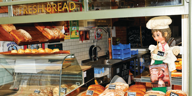
While in many other European countries craft bakeries still dominate the market, the biggest share of the bakery industry in the UK belongs to the sliced and wrapped bread made by large plant bakers. Bread is one of the nation’s undisputed staple foods, with a matching packaging and design industry wrapping up its brands.
Bread is a favorite staple food, purchased by 99 per cent of households in the UK. The three main bread manufacturers in the UK (Allied Bakeries, Hovis and Warburtons) account for almost 80 per cent of the plant bread market by value, and manufactured products account for around three quarters of all bakery products sold in the UK. These numbers show that the bakery business in the UK must be taken seriously. Fortunately, the same goes for the design and packaging of those products.
Today, there is increased demand for a greater variety of bread than ever. Ethnic breads, like pita and naan, became more popular and classic bread loaves and rolls are constantly developing into new varieties.
Breads and rolls
Sandwiches make up to 50 per cent of bread consumed, according to the Federation of Bakers. Sliced bread is one way to make a sandwich. The others are popular rolls. One interesting fact is that across the UK there are so many names for this product that the Craft Bakers’ Association made a map to illustrate these numerous variations. For example bap, cob, morning roll, batch, muffin and buttery are just some of the names used in local bakeries. Large industrial bakeries accepted the universal name of “roll.”
Warburtons is the largest bakery brand and the second biggest grocery brand in the UK. It was established in Bolton in 1876 by Thomas and Ellen Warburton. In 2011, they redesigned the whole brand and gave it a simpler, distinctive and easy-to-recognize look. The whole project was made by the Smith & Milton branding, design, and communications group based in London.
The color of the logotype was changed from red to orange to present a warmer and more contemporary look. The goal was to make the brand stand out on the shelf and to enhance consumer awareness and interest. It went from a classic color scheme with red, white, and blue, and ribbons, and a diamond on the back with golden borders, to a simple one-color typographic design. It instantly gained strength and modernity.
The new logotype has been just the beginning of the visual reinvention of the brand. All 75-plus products had a complete makeover. The name of the brand is usually placed at the top of the package, but in this case the logotype is placed on the bottom. Although not standard, it is a perfect spot for this strong element.
The packaging design of breads is simple, color-coded and very strong because of the simple and large elements on the front. Even with large, raw elements, and thanks to the use of colors and the chosen typography, they managed to achieve a playful design.
Read the full article, with more on Warburtons’ branding evolution, as well as a study of branding identities of Hovis and Kingsmill, in European Baker – January/February edition.