
Branding Healthy Bread in the Middle East
Health and wellness hold the growth potential in Middle Eastern bakery. Here are some examples.
The Modern Bakery is a family-owned company, established in 1975. It is the largest commercial bakery in the United Arab Emirates, producing bread, pastry, and Arabic sweets for the whole region. With an impressive number of more than 2,500 different products, the company’s proactive research and development unit follows the latest global trends and translates them into innovative products adjusted to local consumers.
It is no wonder the company is currently pushing a “healthier” product range, including “health and nutrition” breads: Protein bread, Quinoa bread, Chia bread, Diet bread, Gluten-Free and Yeast-Free bread. The Chia and Quinoa breads were launched in April 2016.
The Modern Bakery is not only “modern” in the sense that it provides the region with on-trend baked products.
In June 2016, the company introduced a new design for some of its breads, mainly from the healthy range, with straightforward and clean graphics – made within a subtle, dimmed color range, and using transparent shapes to emphasize the texture of packaged products. With Chia and Quinoa bread, the approach was a bit different. The basic colors were taken from the brand book, but the special ingredients are presented with photographs. The product names are placed on the right, highlighted on a darker background shape, with handwritten letters and small plant illustrations. The design made for the rest of the range works flawlessly, with bold lines and large graphic elements – which make the design highly visible and easy to read. Chia and Quinoa lack this clarity, with some of the message being hard to read. This is unfortunate, because the products are innovative and appealing and the packaging should complement them. “Longer” products enjoy a better visibility in this regard, since the name is placed on the horizontal dark shape across the whole package.
Egypt’s Best Bread
Not to be confused, Egypt has a leader in the industry with an almost identical name: Modern Bakeries. The company was founded in 1997, as a pioneer of the packaged bread industry in the country, and with a vision to become a domestic #1. A few years later, the company reached that goal; it now plays an important part in all Middle Eastern markets, with a wide product portfolio built on four different brands of bread, pastries, and cakes.
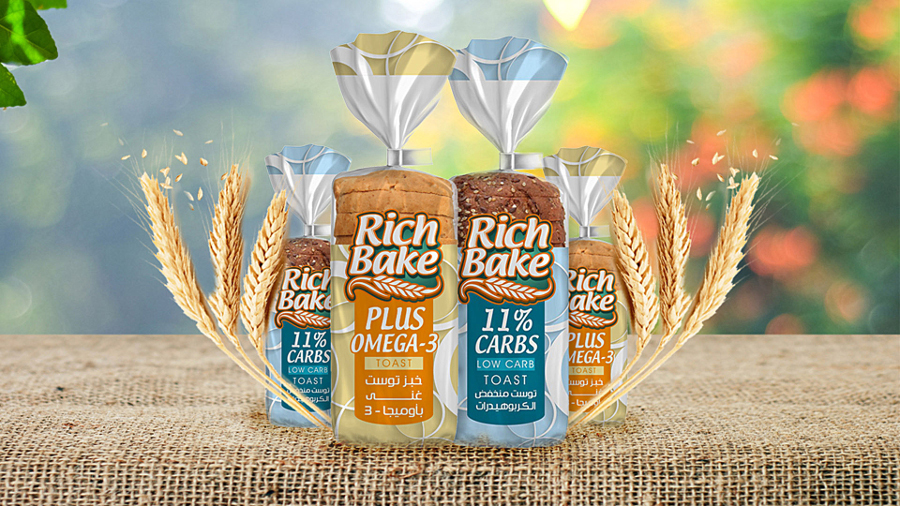
The most popular packaged bread range they offer is Rich Bake. This brand consists of different types of bread, rolls, and toast (among other products), and every line has at least one healthy option. In addition, they offer a small product line called Wellbeing enriched with multi-grains.
According to Euromonitor, more than 80% of bread eaten in Egypt is white. Health-focused solutions are yet to be recognized as preferable by consumers. That is why it’s important to present this type of options. Sometimes, they are just an addition to the existing range, and sometimes the healthier variants are made under a different sub-brand, like Wellbeing.
The entire product portfolio is branded with the “rich” visual of the Rich Bake logotype. The logotype is bold and well crafted. It follows the industry standards and design rules; the colors are well balanced, and they complement each other. The name and the illustration are nicely placed in the closed square composition, giving the logotype a stamp-like quality. This feature makes it easy to be applied to materials in various sizes, shapes or colors. The logotype was inspired by retro bakery visuals, with a “soft” typography with round edges and a wavy wheat illustration.
The newest additions to the Rich Bake product portfolio, Plus Omega 3 Toast and 11% Carbs, Low Carb Toast, are a direct response to the health trend. The packaging design of both products follows the brand’s rules, making the logotype the most prominent element, each with its own background. The transparent part of the packaging film is much smaller, making the background color and graphics stand out on the shelf.
Read the full article in Asia Pacific Baker & Biscuit, Autumn 2017.